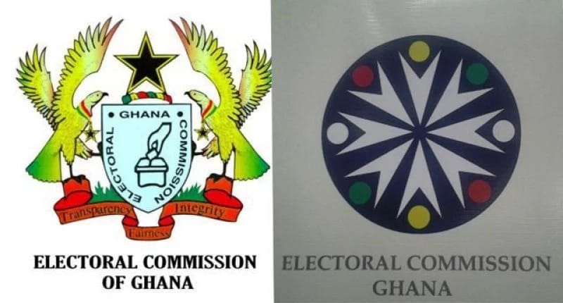
5 things the Electoral Commission wants you to know about its new logo
A document concerning the much talked about Electoral Commission (EC’s) new logo has been sighted.

READ ALSO: Mahama swears in governor of Central Bank
The logo, has generated a lot of debate among the public with some suggesting that the EC embarked on a needless venture by changing the original one, whilst others criticized the logo of being of poor quality and not communicating the functions of the commission.
READ ALSO: Brong Ahafo police to involve more women in activities
President Mahama joined the fray and asked all to put an end to the debate which he described as needless at a quarterly meeting with the members of the Council of State.

However, these are 5 salient things concerning the document that the EC wants every Ghanaian to know
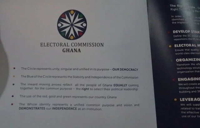
The circle represents unity; singular and unified in its purpose – OUR DEMOCRACY
The blue of the circle represents the Stability and Independence of the Commission
The inward moving arrows reflect all the people of Ghana EQUALLY coming together for the common purpose – the right to select their political leadership
The use of the red, gold and green represents our country Ghana
The Whole identity represents a unified common purpose and vision and DEMONSTRATES our INDEPENDENCE as an institution.
READ ALSO: I met Gh¢89 in NPP’s account – Afoko
Source: YEN.com.gh
